Redesigning a Digital Benefits Platform for Clarity and Self-Service
Transforming a high-volume support burden into a seamless user experience through intuitive design, smart self-service tools, and cross-team collaboration.

UX Designer
Fintech
Figma
2024-ongoing
Challenge
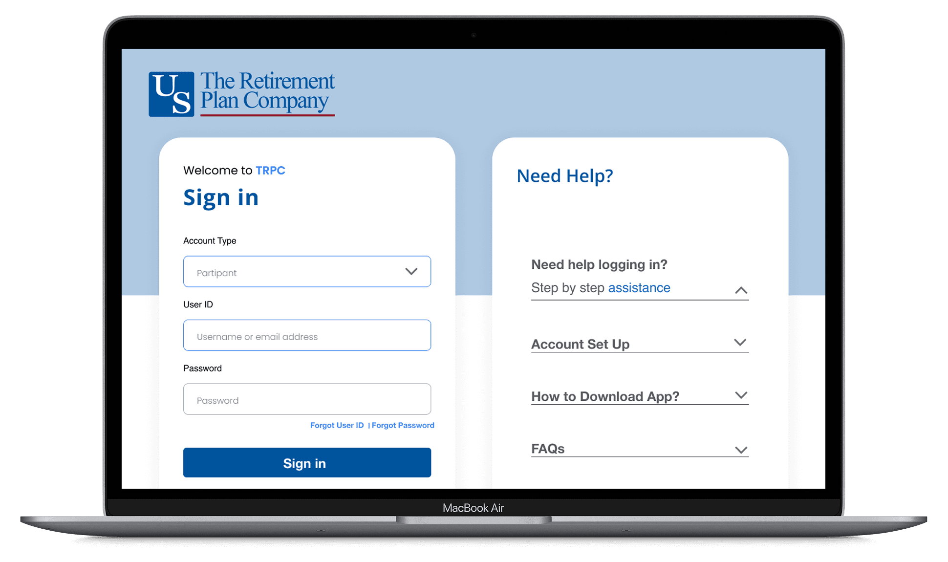
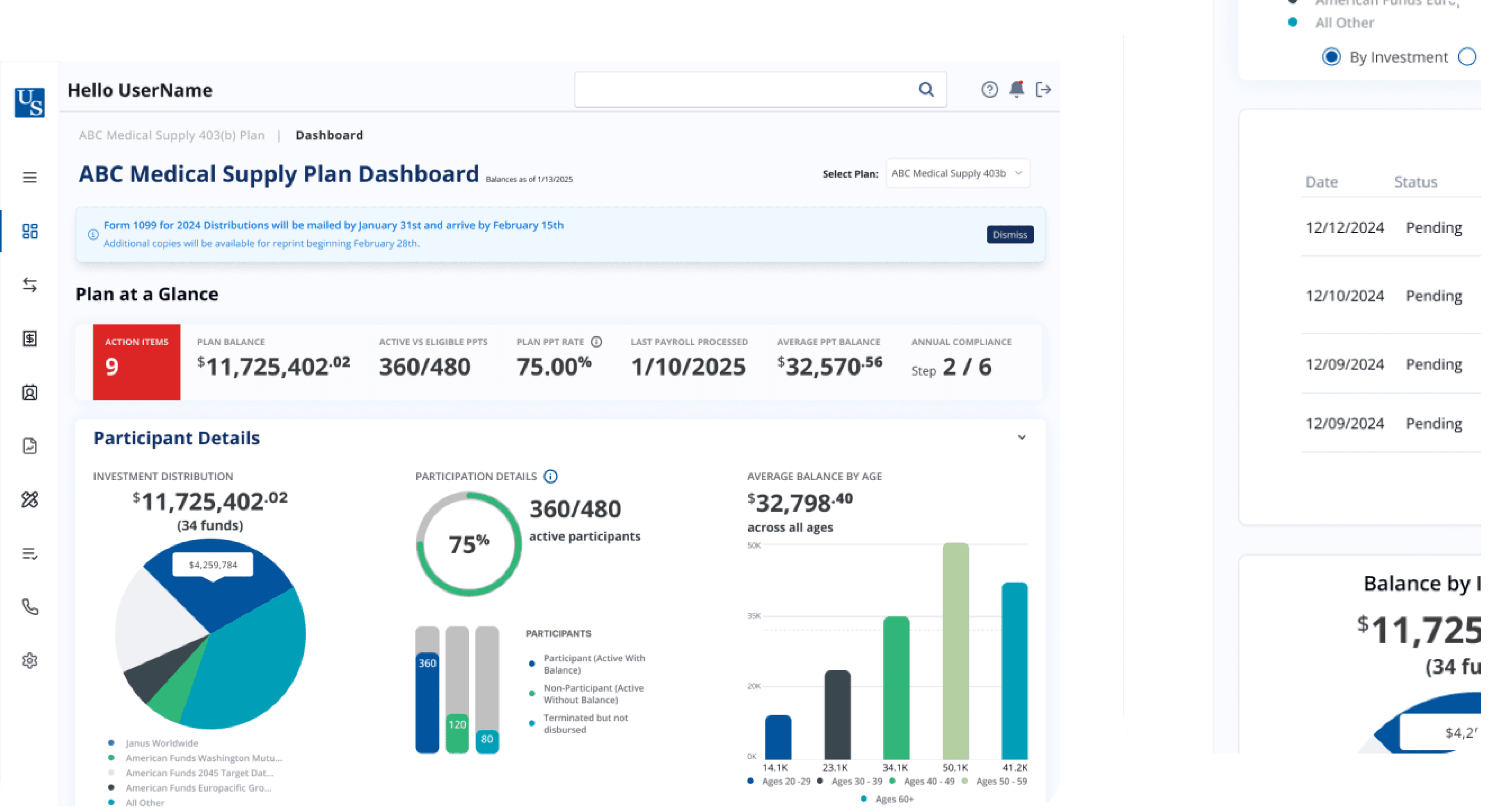
USRBP’s online benefits platform was creating more problems than it solved. The site’s confusing UX led to an overwhelming number of basic support tickets that could have been avoided with better design. Users struggled to find what they needed, and the internal help desk was flooded. As client expectations grew, the platform’s poor scalability and fragmented user flows became a serious liability. The business urgently needed a modern, intuitive experience that empowered users to self-serve while reducing operational overhead.
Results
The redesigned platform significantly reduced user friction and support dependency. Support ticket volume dropped by 50%, while user-reported errors decreased by 30%. With clearer navigation and a guided help module, users were able to complete tasks more independently and accurately. Internally, teams experienced stronger alignment across product, IT, and support—resulting in faster decision-making and reduced development backlog. Overall, the platform became more intuitive, scalable, and user-centered, delivering measurable improvements in both efficiency and satisfaction.
50%
Support tickets down
30%
Decrease in user-reported errors
20%
Reduction in development ticket backlog


Process
Research & Analysis: We started with a comprehensive UX audit and conducted user interviews, heatmap analysis, and stakeholder workshops. The team identified core friction points—navigation confusion, unclear error states, and redundant support inquiries.
Information Architecture: We restructured the platform’s architecture to make navigation more intuitive. A guided help module was introduced—a proactive, lightweight tool that answered common user questions without needing live support.
Wireframing & Prototyping: Low-fidelity wireframes were used to test new navigation flows and self-service elements. After several rounds of testing and iteration, we built a high-fidelity prototype that addressed user confusion and eliminated redundant clicks..
Usability Testing: We conducted usability tests with a diverse group of users to validate the design and identify areas for improvement. Based on the feedback, we made necessary adjustments to the design.
Visual Design & Accessibility: We delivered a clean, accessible design system that made key actions clear and discoverable. This included a modernized visual language, simplified icons, and consistent feedback states for error prevention..

“The user-centric design helped retirees confidently manage their portfolios and plan ahead with ease.”


Conclusion
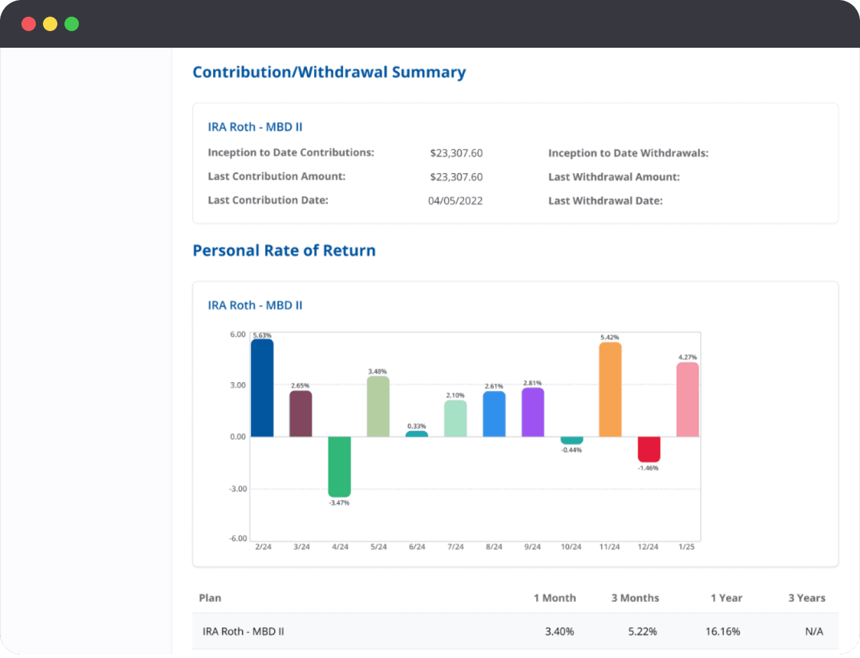
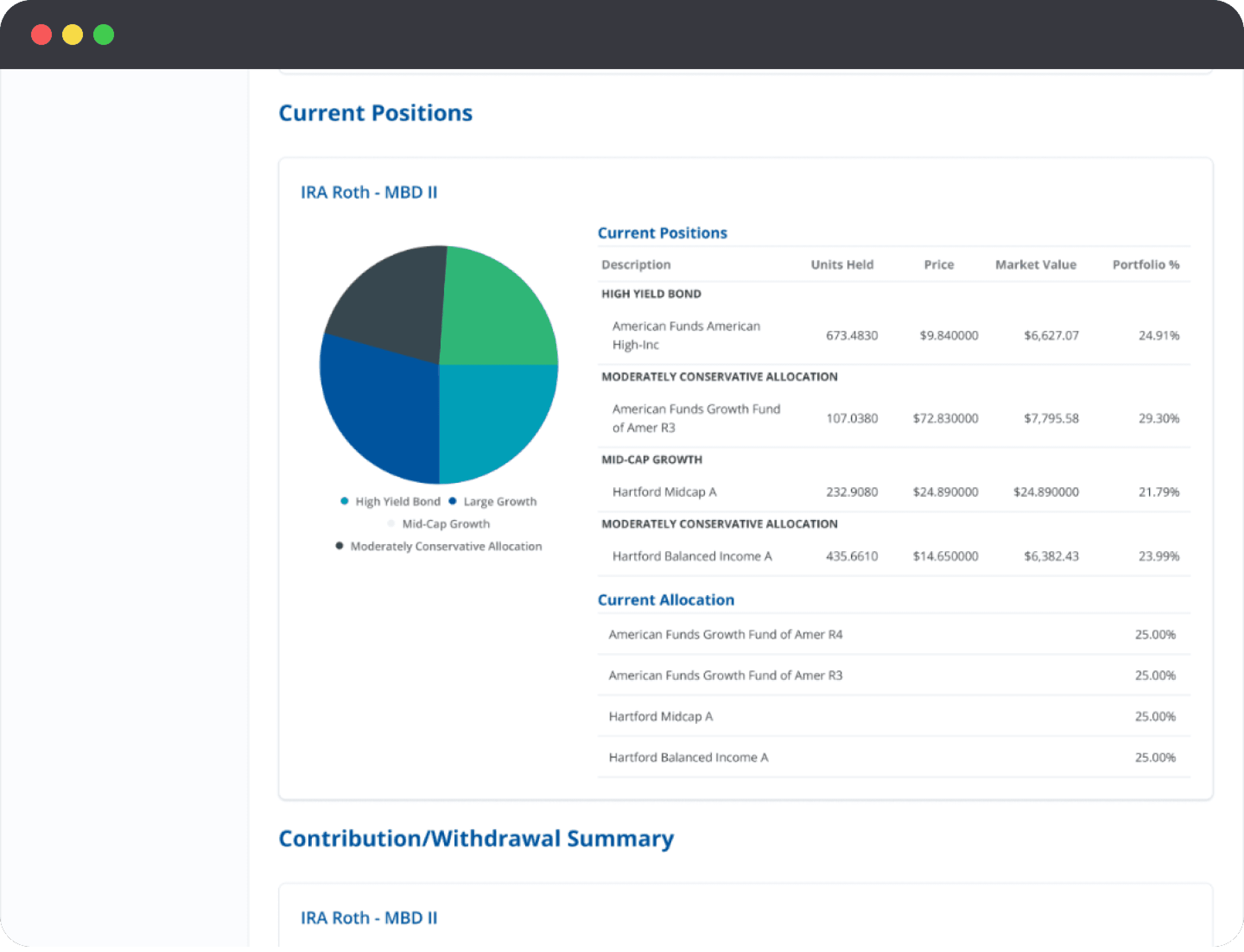
This project successfully delivered a modern, intuitive retirement management platform that empowers users to take control of their financial futures. By focusing on clear data visualization and streamlined workflows, the redesign enhanced user confidence and engagement, ultimately supporting better retirement planning decisions. This project highlights the power of user-centered fintech design in simplifying complex financial tasks and improving overall customer satisfaction.