Modernizing an Agent Portal for Faster Workflows and Smarter Navigation
A full UX overhaul for a regional insurance carrier, enhancing agent efficiency, reducing errors, and creating a scalable platform built for future growth.

Lead UX Designer
Insurance
Figma
7 months
Challenge
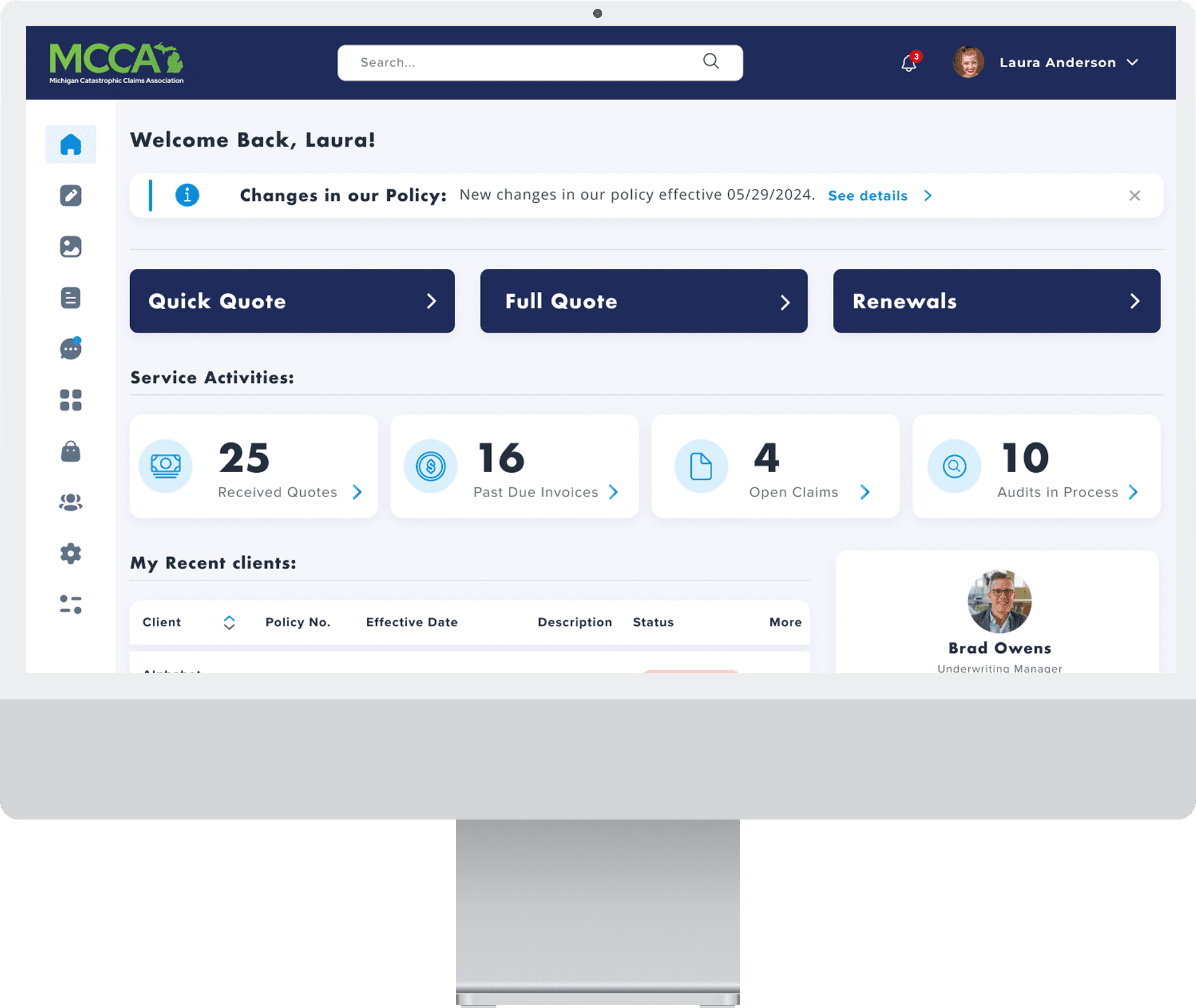
The legacy insurance portal was holding agents back. With inconsistent layouts, inefficient workflows, and outdated tech, users were struggling to perform even routine tasks like quoting or searching for a policy. Onboarding new agents took weeks, and support teams were flooded with tickets stemming from avoidable user errors. The interface lacked accessibility, scalability, and flexibility—making it hard to maintain and nearly impossible to evolve.
Our mission was clear: redesign the portal to streamline workflows, eliminate friction, and empower agents with a system that actually worked for them—not against them.
Results
The redesigned portal led to a 45% increase in task completion speed for agents and a 25% reduction in training time for new users. By simplifying navigation and optimizing key workflows, the platform significantly reduced errors and confusion. Agents reported greater satisfaction with the streamlined interface, and internal teams were better aligned around a shared vision for usability and scalability. The new design also established a solid foundation for future enhancements, ensuring the platform could evolve alongside business needs.
45%
Task completion
25%
Training time down
84%
Increase in time spent on website


Process
Research & Analysis: I conducted heuristic audits and stakeholder interviews with agents, underwriters, and support reps to uncover major issues in the legacy portal. Pain points included inconsistent UI, poor workflow logic, accessibility gaps, and a steep onboarding curve. We benchmarked modern tools like Guidewire and Applied Epic for UX inspiration.
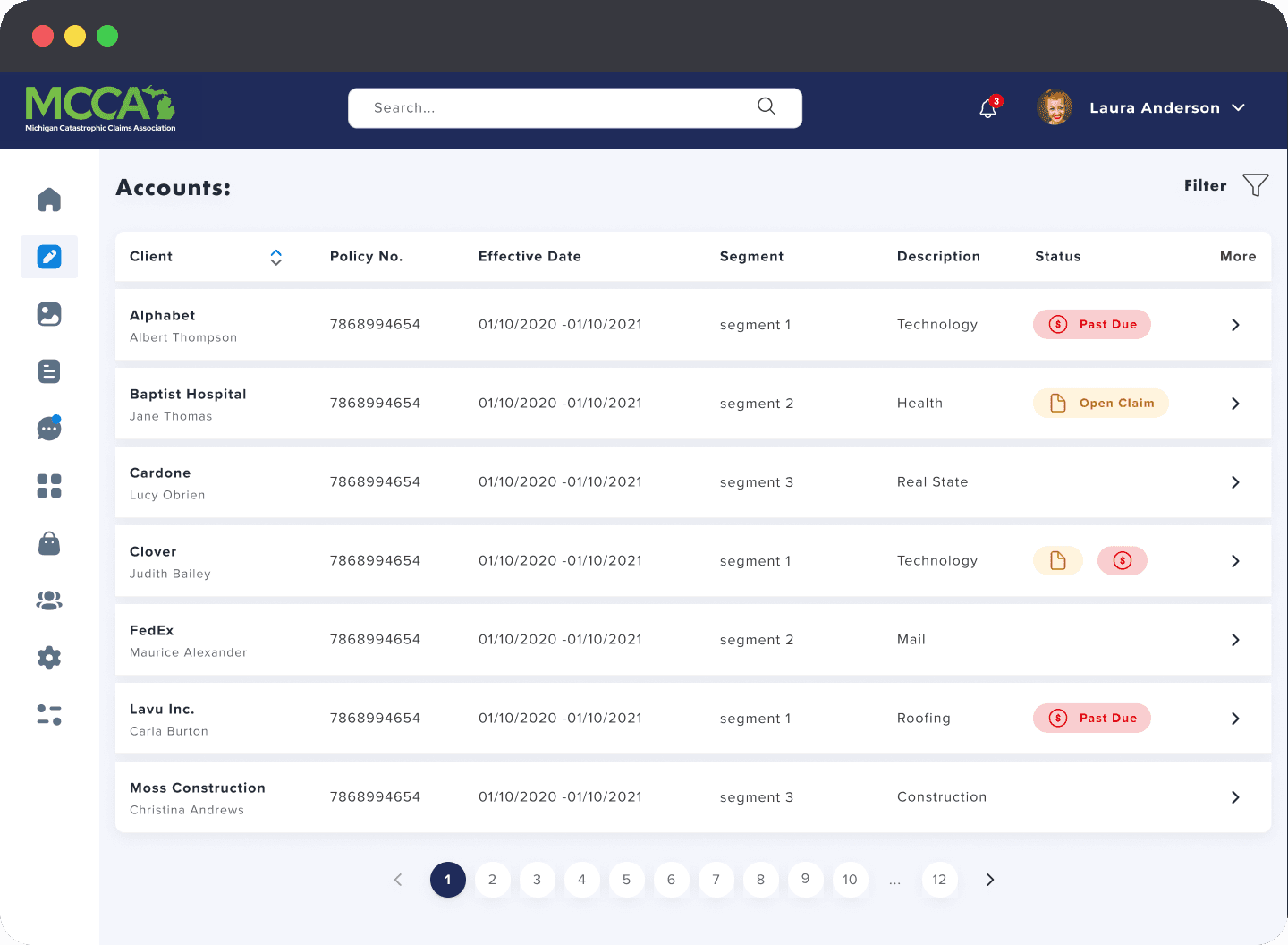
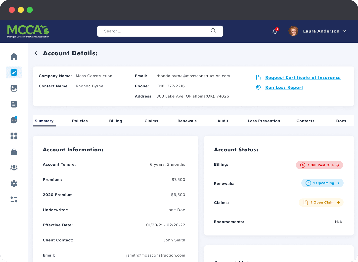
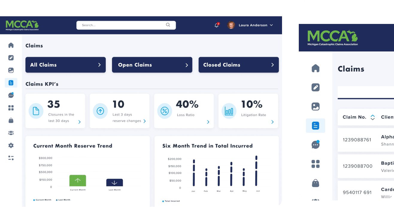
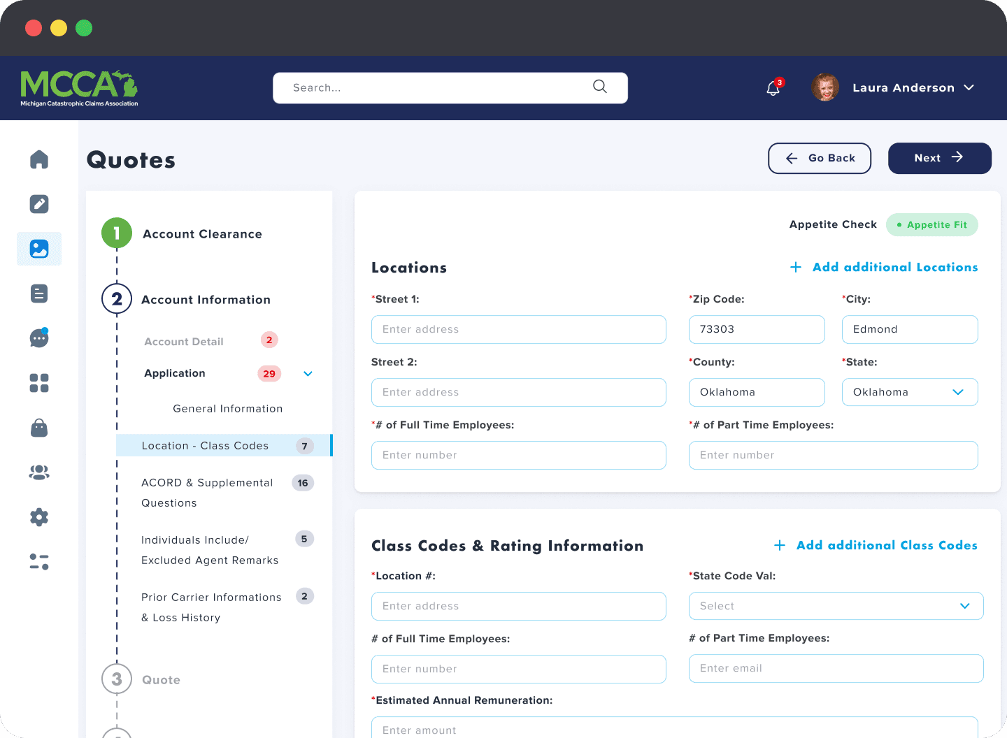
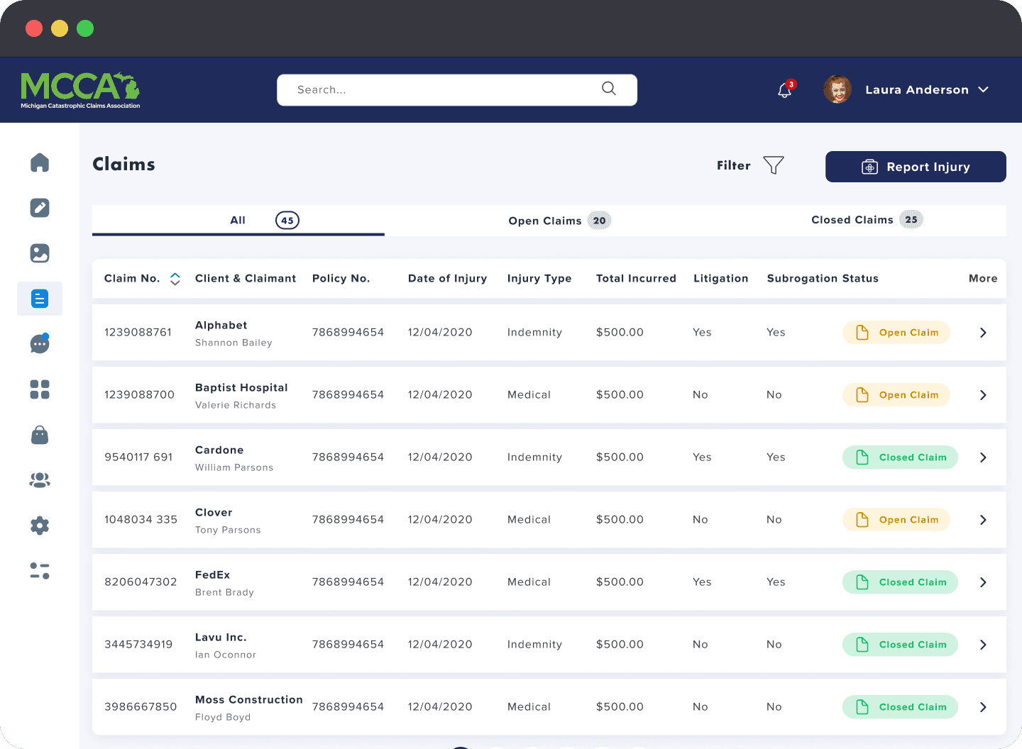
Information Architecture: We restructured the portal’s layout and navigation to reflect actual workflows. A task-based dashboard, persistent search, and progressive disclosure helped agents complete tasks like quoting, searching, and servicing with far less friction.
Wireframing & Prototyping: Created wireframes and interactive flows in Figma, iterating through 4–5 rounds of testing. Design explored chunked form containers, quick-access nav, and clear error handling for quoting and servicing forms.
Usability Testing: Tested with new and experienced agents to validate improvements. Results showed increased speed in quoting tasks and significantly reduced error rates. Feedback helped simplify forms, clarify inputs, and improve system feedback.
Visual Design & Style Guide: Created a clean, Design system optimized for scalability and accessibility. All elements met WCAG 2.2 standards and were documented for developers.

“Redesigning the portal has cut agent processing time in half, dramatically improving productivity and satisfaction.”
“The streamlined workflows and modern UI helped agents close cases faster with fewer errors.”


Conclusion
This project wasn’t just about refreshing a UI, it was about rethinking how agents work and designing a platform that scales with them. I learned how to balance enterprise complexity with user-centered clarity, how to build for long-term growth, and how to align executive vision with frontline needs.
Designing for enterprise means solving big, invisible problems—and removing friction at scale. This portal redesign laid the groundwork for a more agile, accessible, and agent-first future.